Client information
I created my first portfolio website in 2010 with wordpress 2.9. After the release of WordPress 3.0 a lot has happened in regards to how wordpress handless content management. I was eager about the progress and decided to dig into the updated architecture of wordpress 3.5 to use the new features. Plus, it was about time to make my web page responsive.
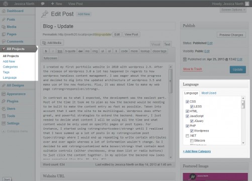
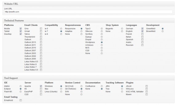
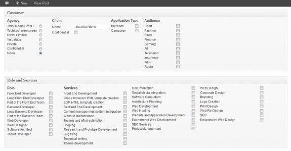
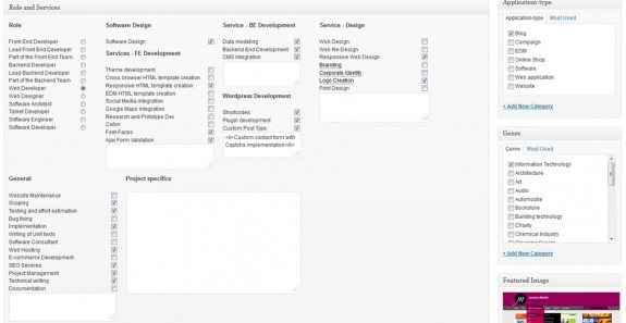
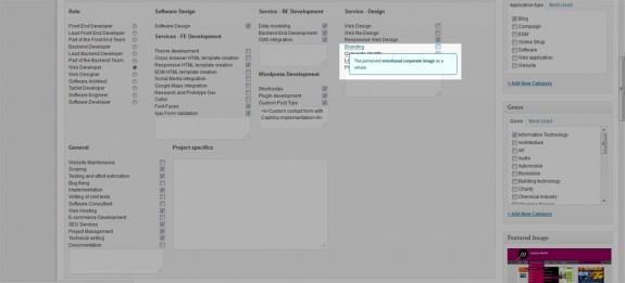
In contrast as to what I expected, the development was the easiest part. Most of the time it took me to plan how the backend would have to be built to make the content entry as fast as possible. Taken into account that I want the site to be multilingual. WordPress does offer great and powerful strategies to extend the backend. However, I just needed to decide what content I will be using all the time and what content would be only used on specific pages or post types. For instance, I started using shortcodes until I realized that I have summed up a lot of posts in my custom post type (see Fig. 01) where I would end up repeating to write certain attributes over and over again whereas a lot of information wouldn’t change. So I decided to add customized meta boxes that contain most suitable controls (either checkboxes, drop down list or radio buttons) to just click the content together. In my opinion the backend now looks more organized (See Fig. 02, Fig. 03).
To use the right tools for the right cause, I used Microformats to standardize the way the information is marked up so that it can easily be extracted. Unfortunately, there are not many tools that support microformats yet as I wished it to be but the fact is: Microformats can easily be used and don’t cause any side effects if the browser does not know the format. On the other hand, they can be of great benefit if the client is receptive to microformats. E.g. there are browser plugins that extract microformats on a page and you can export and update event dates or contact information with just one click in your event calendar or adress book.
Since it is very important to me to only use JavaScript to extend the user experience but not rely on it. I carefully made sure to follow this maxime while not giving up on latest technologies. For example, the main menu drop down listings are purely made via CSS. Also, on the posts overview pages the date that moves up from the bottom of the thumbnail once the user hovers over it is done via CSS3 animations (see Fig. 06). Only on IE8 and IE7 which unfortunately do not cope with CSS3, I made the same animation work with the help of JavaScript. However, if JavaScript is turned off, the date will be visible right from the start.
Also there are different approaches as to how to provide a menu for mobile phones whereas many of them also rely on JavaScript. In the case of mobile phones or tablets I think it is ok to rely on JavaScript but if there is a way without it while getting the same result in regards to function I will always go with that approach. So I used the off-canvas method to make the main menu work without JavaScript. This method uses the native :target CSS selector to decide whether or not the menu needs to be visible. In case the menu needs to be fancy e.g. fading in or smoothly sliding down, that can still be done via JavaScript.
[1] https://addons.mozilla.org/En-us/firefox/addon/operator/
Technical Features
- Platforms: Mobile, Tablet, Desktop
- Project Group: Greenfield
- HTML5: Yes
- Responsiveness: Responsiv
- Browser Compatibility: IE7+
- CMS: WordPress
Tool Support
- IDE: IntelliJ
- Server: Apache
- Platform: Windows
- Version Control: Git (Tortoise)
My Services
- Frontend Services
- Theme development
- Responsive cross browser compatible HTML template creation
- Ajax form validation
- Backend Services
- Development of the backend
- CMS integration
- Web Design Services
- Web Design
- Corporate Identity
- Logo creation
- General services
- Website Maintenance
- Deployment
